
Research
8 bit games
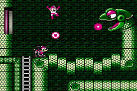
8 bit games sprites are done in a 16 x 16 or a 32 x 32 frame, use an RBG scale to colour and cost a low amount of memory. This style was used in the early days of video games because the hardware at the time was severely limited on how much data could be stored. 8 bit has also become an iconic art style, being used as a tribute to old classic titles. 8 bit is simple, yet effective.
/https://public-media.si-cdn.com/filer/7f/4c/7f4c2d11-089f-4d86-8052-5cf95295be7e/file-20180531-69508-1oenzpj.png)
16 bit games
16 bit games allow larger, more colourful and more detailed sprites, but take up more memory, which is why this type of pixel art wasn’t used until the hardware was powerful enough to handle it, such as the SNES and Sega Genesis.
32 bit games
32 bit games are very detailed when it comes to pixel art, which in turn would be very time consuming to animate and take up a lot of memory. 32 bit sprites would also cost more money to make due to the amount of detail required.
The most popular console is the PS1, and the PS1 saved games on CDs. These CD’s have an average side of 150MB. This meant that most animations would be limited in frames to save in size. Lots of assets me be repeated/ recoloured.

Proposal
In this project, I will utilize the style of 8-bit in my shoot em up game. The theme of my game will have something to do with planes, as that is the easiest theme to animate and in theory, would cost less. In my opinion, the style is also a lot crispier compared to more detailed sprites, which has its own charm.
Planning
I will plan to use simplistic styled planes as my game theme, as this decreases the amount of animation frames required to create a smooth action.


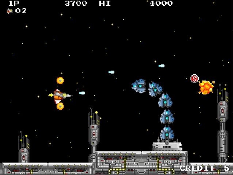
All of these images from my moodboard show that top down plane shooters usually have the player character placed at the bottom of the screen, with enemies advancing from the top. Or the player is on the left, while enemies advance from the right. However, most vertical shoot em ups are forced to adjust the frame to fit a screen, which results in space being empty. The landscape shoot em up takes up the entire frame and as most other games are set for the player to travel from left to right, I will therefore use a landscape style in my project.
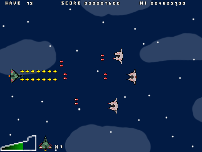
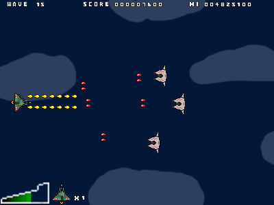
The HUD usually consists of the player’s health, score and lives, amount of enemies left, wave counts and sometimes enemy health. In my project, I will utilize the essentials, such as player health, lives and wave counts.


Concept art
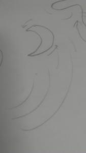
Boomerangs:
- Hard to predict
- Unique to straight bullets


Crabs look really cool

Sharp edges:
- Connotates danger
- Look like pincers
Development
Originally, I added stars into my background, but scrapped the idea because they started to look like bullets because of how much it stood out from the background.


![]()


![]()
![]()
![]()
![]()
![]()
![]()
![]()
![]()
![]()
![]()
![]()
![]()
![]()
![]()
![]()
![]()

Evaluation
In my project, I tried to work towards an 8 bit style of game. I did this by reducing the amount of pixels I worked with. I used a 16×16 canvas to create the player and enemy sprites and 8×8 for the UI elements. (with a few exceptions).
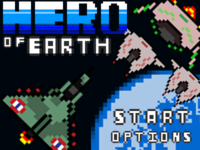
I think my art was very effective in doing this. I believe my sprites had good colour contrast and design that stood out against the background. My favourite pieces of work consist of the title screen design and the text font used for most UI and title elements. In my opinion, my title screen is designed to be a very dynamic action shot, with the player and enemy sprites facing each other. A 64×64 bit globe takes up the bottom right part of the background to show a purpose for the game; that the player is trying to defend earth. I also like the main title: “HERO” because the gradient was styled around the mega man titles. Each letter is 128×128 pixels in order to properly scale the sprite up and maintain a gradient. The text is designed to be simple, but effective. It has a unique style and is easy to read.
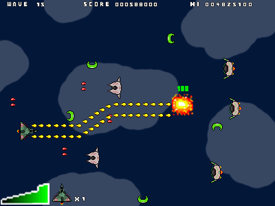
I considered my colour choices carefully in order to create a clear contrast of colour between the main elements of my game: The background, the player, and the enemies. I chose a semi space-like background because it was a simplistic dark blue colour. This was the option I chose, opposed to a sky background, which is a bright blue. My enemy designs share a main colour scheme of light grey to represent the sci-fi theme. The enemies also have a distinct colour scheme base on what type they are, to represent the type of weapon shot used. I only had time to program two different type of enemies as my programming skills are below average.
In my game, I utilized 2D mechanics such as a scoring system, which was a standard in most arcade games that would be a secondary indicator of a player’s progress and skill, and would also be a system to psychology want the player to best their top score by playing again, which maintains replayability. I also set out to create various types of enemies that would shoot different types of bullets, which in a top down shooter game is a key aspect of the genre. I created two enemy types: one red, which be the standard enemy that shoots similarly to the player, and one green, which would shoot boomerang-like projectiles. I had planned to create more, but I didn’t have enough time to undergo the process of making more designs.
To create all of my art, I used Photoshop because of its resources. I created very small canvases (such as 8×8, 16×16 etc) which allowed me to use the pencil tool to work with individual pixels on a larger scale when zoomed in.
I feel like I have overall met my proposal by making an 8 bit shoot em up game, but later in development, I decided to delve into a more space themed genre, which resulted in a product a little in between both themes. In my opinion, my art has successfully met the quota of being in a crisp, 8 bit style. My choices in colour is shown to contrast very well against the background and other sprites. I feel like I have successfully created sprites with a good variation in saturation and contrast that make each sprite unique to one another.
Overall, I have enjoyed this project. In particular, I have enjoyed the art aspect of the project, as creating art is something I feel free when doing. On the other hand, I did not enjoy the coding section, however, because of the many frustrations the process of programming can give, such as having an error that takes too long to find and brings production to an immediate halt until the problem is found and fixed.
